
马上快过年了 我也不想被人捷足先登呀 放一段代码用来装饰你的Blog或者个人小站点
这样才有喜庆劲儿呢 博客:后台设置自定义输出head 头部的HTML代码 粘贴代码
单页引导页:找到<head> 在前面粘贴代码就好了
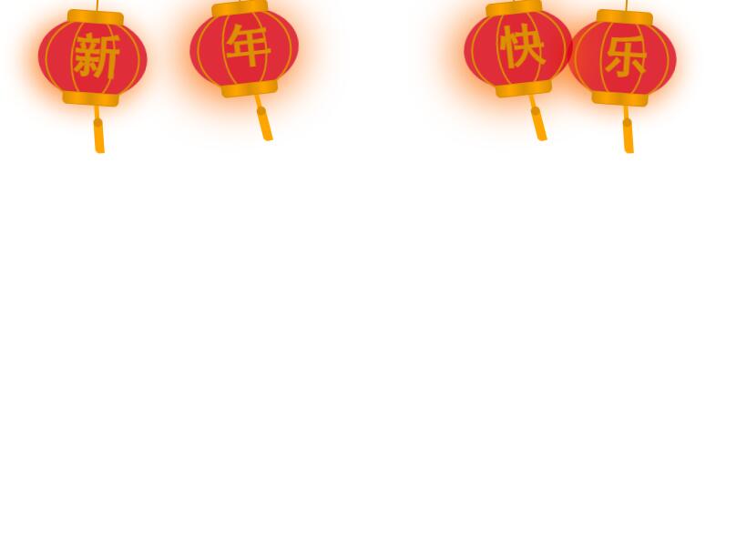
代码如下
<!-- 灯笼代码 -->

<meta charset="utf-8">

<div class="deng-box2">

<div class="deng">

<div class="xian">

</div>

<div class="deng-a">

<div class="deng-b">

<div class="deng-t">年</div>

</div>

</div>

<div class="shui shui-a">

<div class="shui-c">

</div>

<div class="shui-b"></div>

</div>

</div>

</div>

<div class="deng-box3">

<div class="deng">

<div class="xian">

</div>

<div class="deng-a">

<div class="deng-b">

<div class="deng-t">新</div>

</div>

</div>

<div class="shui shui-a">

<div class="shui-c"></div>

<div class="shui-b">

</div>

</div>

</div>

</div>

<div class="deng-box1">

<div class="deng">

<div class="xian">

</div>

<div class="deng-a">

<div class="deng-b">

<div class="deng-t">乐</div>

</div>

</div>

<div class="shui shui-a">

<div class="shui-c"></div>

<div class="shui-b"></div>

</div>

</div>

</div>

<div class="deng-box">

<div class="deng">

<div class="xian">

</div>

<div class="deng-a">

<div class="deng-b">

<div class="deng-t">快</div>

</div>

</div>

<div class="shui shui-a">

<div class="shui-c">

</div>

<div class="shui-b"></div>

</div>

</div>

</div>

<style type="text/css">

.deng-box {

position: fixed;

top: -40px;

right: 150px;

z-index: 9999;

pointer-events: none;

}

.deng-box1 {

position: fixed;

top: -30px;

right: 10px;

z-index: 9999;

pointer-events: none

}

.deng-box2 {

position: fixed;

top: -40px;

left: 150px;

z-index: 9999;

pointer-events: none

}

.deng-box3 {

position: fixed;

top: -30px;

left: 10px;

z-index: 9999;

pointer-events: none

}

.deng-box1 .deng,

.deng-box3 .deng {

position: relative;

width: 120px;

height: 90px;

margin: 50px;

background: #d8000f;

background: rgba(216, 0, 15, .8);

border-radius: 50% 50%;

-webkit-transform-origin: 50% -100px;

-webkit-animation: swing 5s infinite ease-in-out;

box-shadow: -5px 5px 30px 4px #fc903d

}

.deng {

position: relative;

width: 120px;

height: 90px;

margin: 50px;

background: #d8000f;

background: rgba(216, 0, 15, .8);

border-radius: 50% 50%;

-webkit-transform-origin: 50% -100px;

-webkit-animation: swing 3s infinite ease-in-out;

box-shadow: -5px 5px 50px 4px #fa6c00

}

.deng-a {

width: 100px;

height: 90px;

background: #d8000f;

background: rgba(216, 0, 15, .1);

margin: 12px 8px 8px 8px;

border-radius: 50% 50%;

border: 2px solid #dc8f03

}

.deng-b {

width: 45px;

height: 90px;

background: #d8000f;

background: rgba(216, 0, 15, .1);

margin: -4px 8px 8px 26px;

border-radius: 50% 50%;

border: 2px solid #dc8f03

}

.xian {

position: absolute;

top: -20px;

left: 60px;

width: 2px;

height: 20px;

background: #dc8f03

}

.shui-a {

position: relative;

width: 5px;

height: 20px;

margin: -5px 0 0 59px;

-webkit-animation: swing 4s infinite ease-in-out;

-webkit-transform-origin: 50% -45px;

background: orange;

border-radius: 0 0 5px 5px

}

.shui-b {

position: absolute;

top: 14px;

left: -2px;

width: 10px;

height: 10px;

background: #dc8f03;

border-radius: 50%

}

.shui-c {

position: absolute;

top: 18px;

left: -2px;

width: 10px;

height: 35px;

background: orange;

border-radius: 0 0 0 5px

}

.deng:before {

position: absolute;

top: -7px;

left: 29px;

height: 12px;

width: 60px;

content: " ";

display: block;

z-index: 999;

border-radius: 5px 5px 0 0;

border: solid 1px #dc8f03;

background: orange;

background: linear-gradient(to right, #dc8f03, orange, #dc8f03, orange, #dc8f03)

}

.deng:after {

position: absolute;

bottom: -7px;

left: 10px;

height: 12px;

width: 60px;

content: " ";

display: block;

margin-left: 20px;

border-radius: 0 0 5px 5px;

border: solid 1px #dc8f03;

background: orange;

background: linear-gradient(to right, #dc8f03, orange, #dc8f03, orange, #dc8f03)

}

.deng-t {

font-family: 黑体, Arial, Lucida Grande, Tahoma, sans-serif;

font-size: 3.2rem;

color: #dc8f03;

font-weight: 700;

line-height: 85px;

text-align: center

}

.night .deng-box,

.night .deng-box1,

.night .deng-t {

background: 0 0 !important

}

@-moz-keyframes swing {

0% {

-moz-transform: rotate(-10deg)

}

50% {

-moz-transform: rotate(10deg)

}

100% {

-moz-transform: rotate(-10deg)

}

}

@-webkit-keyframes swing {

0% {

-webkit-transform: rotate(-10deg)

}

50% {

-webkit-transform: rotate(10deg)

}

100% {

-webkit-transform: rotate(-10deg)

}

}

</style>
下载说明:
1、本站所有资源均从互联网上收集整理而来,仅供学习交流之用,因此不包含技术服务请大家谅解!
2、本站不提供任何实质性的付费和支付资源,所有需要积分下载的资源均为网站日常活跃所需,积分可通过日常活跃免费获得!
3、本站所有资源仅用于学习及研究使用,您必须在下载后的24小时内删除所下载资源,切勿用于商业用途,否则由此引发的法律纠纷及连带责任本站和发布者概不承担!
4、本站站内提供的所有可下载资源,本站保证未做任何负面改动(不包含修复bug和完善功能等正面优化或二次开发),但本站不保证资源的准确性、安全性和完整性,用户下载后自行斟酌,我们以交流学习为目的,并不是所有的源码都100%无错或无bug!如有链接无法下载、失效或广告,请联系客服处理!
5、本站资源除标明原创外均来自网络整理,版权归原作者或本站特约原创作者所有,如侵犯到您的合法权益,请立即告知本站,本站将及时予与删除并致以最深的歉意!
6、如果您也有好的资源或教程,您可以投稿发布,成功分享后有站币奖励,同时还能获得对应的人气!
7、如果您喜欢该资源,请支持官方正版资源,以得到更好的正版服务!
8、请您认真阅读上述内容,注册本站用户或下载本站资源即您同意上述内容!
原文链接:http://www.yonghengzy.cn/blog/28520.html,转载请注明出处。


评论0